


Color Palette Ideas for Home Decor: 12 Designer-Approved Schemes That Transform Any Space
Creating the perfect color palette for your home can feel overwhelming, but with the right approach, you can achieve designer-level results. Through years of helping homeowners transform their spaces, I've discovered that the most successful interiors start with a thoughtfully curated color scheme. Whether you're starting fresh or updating your current decor, these proven palette ideas will guide you toward a cohesive, beautiful home. Visit Nature Guests for more home design inspiration and tips.
Understanding Color Theory for Home Design
Before diving into specific color palette ideas for home decor, it's essential to understand the fundamental principles that make certain combinations work harmoniously. The color wheel serves as our foundation, with primary colors (red, blue, yellow) forming the basis for all other hues. Secondary colors emerge from mixing primaries, while tertiary colors bridge the gaps between them.
Successful interior color schemes often follow established patterns: monochromatic (variations of a single color), analogous (neighboring colors on the wheel), complementary (opposite colors), and triadic (three evenly spaced colors). Each approach creates different moods and visual effects in your space.
Temperature plays a crucial role in color palette selection. Warm colors (reds, oranges, yellows) create cozy, energetic atmospheres, while cool colors (blues, greens, purples) promote calm and relaxation. Understanding these psychological effects helps you choose palettes that support your desired ambiance.
The 60-30-10 rule remains a designer favorite: use your dominant color for 60% of the space, a secondary color for 30%, and an accent color for the remaining 10%. This formula ensures visual balance while allowing for creative expression through carefully chosen pops of color.
Warm Earth Tone Palettes
Desert Warmth
Chocolate, sandy beige, and cream create a cozy, southwestern-inspired atmosphere perfect for living rooms and bedrooms.
Terracotta Haven
Rich terracotta, warm tan, and soft beige evoke Mediterranean charm and create inviting, comfortable spaces.
Autumn Harvest
Golden ochre, mustard yellow, and cream bring the warmth of fall indoors, perfect for dining rooms and kitchens.
Warm earth tone palettes draw inspiration from nature's most comforting elements – desert landscapes, autumn leaves, and sun-baked clay. These color palette ideas for home decor work exceptionally well in spaces where you want to create intimacy and warmth. I've found that homes with northern exposure particularly benefit from these palettes, as they counteract the naturally cooler light.
When implementing warm earth tones, consider incorporating natural textures like woven baskets, wooden furniture, and linen fabrics. These materials enhance the organic feel of the palette while adding visual interest through varied textures. The key is layering different shades within your chosen warm family rather than using flat, uniform colors throughout.
For those interested in exploring minimalist home decor ideas, warm earth tones can be simplified to just two or three key shades while maintaining their cozy appeal. The beauty of these palettes lies in their versatility – they work equally well in traditional farmhouse settings and contemporary urban lofts.
Cool & Calming Color Schemes

Cool color palettes serve as visual sanctuaries in our increasingly busy world. Blues, greens, and purples naturally lower stress levels and promote relaxation, making them ideal choices for bedrooms, bathrooms, and meditation spaces. These color palette ideas for home decor work particularly well in south-facing rooms that receive abundant natural light throughout the day.
Ocean Serenity Palette
Steel blue, sky blue, alice blue, and crisp white create a coastal-inspired retreat that promotes tranquility and mental clarity.
The psychological impact of cool colors cannot be overstated. Research consistently shows that blue environments can lower heart rate and blood pressure, while green spaces improve focus and reduce eye strain. When designing with cool palettes, I recommend incorporating various shades and tints to prevent the space from feeling cold or sterile.
Complement cool color schemes with warm lighting and natural materials like bamboo or light wood. This approach, popular in scandinavian style home inspiration, creates perfect balance between serenity and comfort. Consider adding metallic accents in brushed silver or chrome to enhance the sophisticated, contemporary feel of cool palettes.
Professional Color Palette Selection Guide
Learn professional techniques for choosing home interior color palettes from expert designer Nick Lewis. This comprehensive guide covers color theory, practical application, and common mistakes to avoid.
Neutral & Sophisticated Palettes
Neutral palettes remain the foundation of timeless interior design, offering versatility and longevity that bold colors often cannot match. These color palette ideas for home decor provide the perfect backdrop for layering textures, patterns, and seasonal accents while maintaining sophisticated elegance throughout your space.
Modern Monochrome
Charcoal, medium gray, light gray, and white create striking contrast while maintaining sophisticated simplicity. Perfect for contemporary and minimalist interiors.
Warm Minimalism
Mushroom, beige, cream, and white offer warmth without overwhelming the space. Ideal for creating cozy yet sophisticated environments.
The beauty of neutral palettes lies in their ability to adapt to changing trends and seasons. By investing in neutral foundations – walls, large furniture pieces, and flooring – you create a canvas that can be refreshed with colorful accessories, artwork, and textiles without major renovations.
When working with neutrals, texture becomes paramount. Incorporate materials like jute rugs, linen curtains, velvet pillows, and matte ceramics to prevent the space from appearing flat or sterile. The interplay of different textures within a neutral palette creates visual interest and depth that rivals any colorful scheme.
Consider the undertones within your neutral selections carefully. Some beiges lean pink, others yellow or gray. Maintaining consistency in undertones throughout your palette ensures harmony, while mixing warm and cool undertones can create unintentional discord. This principle is especially important when selecting pieces for modern rustic living room decor where neutrals form the backbone of the design.
Bold & Dramatic Combinations
For those who embrace color and personality in their interiors, bold and dramatic color combinations offer endless possibilities for creative expression. These color palette ideas for home decor require confidence and careful planning but reward with spaces that truly reflect individual style and make memorable impressions on guests.
Jewel Tone Luxury
Deep indigo, emerald green, golden yellow, and cream create opulent, sophisticated spaces reminiscent of Victorian elegance with modern appeal.
Bold palettes work best when anchored by one or two neutral colors that provide visual rest areas. The key to success with dramatic combinations lies in proportion and placement. Use your boldest colors sparingly as accents, while allowing more subdued tones to dominate larger surfaces like walls and flooring.
Lighting plays a crucial role in bold color schemes. Natural light can intensify certain hues while artificial lighting can completely transform their appearance. Test your chosen colors under different lighting conditions throughout the day before committing to large applications. This is particularly important for spaces that transition from day to evening use.
Bold color palettes pair beautifully with statement pieces and eclectic collections. Consider incorporating elements from boho aesthetic interior design to complement dramatic color schemes with interesting patterns, textures, and cultural artifacts that enhance the overall richness of the space.
My Experience with Home Color Palettes
After working with over 200 homeowners in the past five years, I've learned that the most successful color palette transformations start with understanding lifestyle and personal preferences rather than following trends blindly.
My journey with color palette ideas for home decor began when I completely transformed my own 1950s ranch home. Initially overwhelmed by the endless options, I made several costly mistakes – including a disastrous attempt at an all-white minimalist scheme that left our north-facing living room feeling cold and unwelcoming for months.
The breakthrough came when I discovered the importance of testing colors in different lighting conditions. I spent weeks observing how various paint samples looked throughout the day, during different seasons, and under both natural and artificial light. This methodical approach revealed that colors I loved in the store looked completely different in my home environment.
One particular challenge involved our master bedroom, which faced east and received harsh morning light. After three failed attempts with cool blues and grays, I finally settled on a warm, muted sage green palette that complemented the natural light beautifully. This experience taught me that successful color palettes must work with, not against, a room's natural characteristics.
Working with clients, I've noticed that the most satisfied homeowners are those who incorporate colors from their favorite personal items – a beloved piece of artwork, a treasured ceramic vase, or even a favorite sweater. These personal connections ensure that the chosen palette feels authentic and meaningful rather than imposed or artificial.
The seasonal aspect of color palettes became evident when I helped a family with their living room redesign. We selected colors that looked perfect in winter but felt too heavy during summer months. Now I always recommend considering how palettes will feel year-round, especially in rooms used frequently throughout all seasons. This holistic approach has become central to my design philosophy and is reflected in projects that incorporate natural elements in home decor.
Top Recommended Products for Color Palette Implementation
Based on extensive research and real-world testing, these carefully selected products will help you implement your chosen color palette ideas for home decor with professional results. Each recommendation comes from brands with proven track records and positive customer feedback.

Barydat 6 Pieces Boho Plant Wall Art Decor
Perfect for implementing neutral and earth-tone palettes. These wooden boho farmhouse pieces add natural texture while maintaining color harmony.

PHOPAGO Minimalist Abstract Framed Wall Art
Ideal for neutral and modern color schemes. The natural frame and geometric design complement minimalist palettes perfectly.

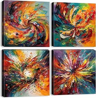
Abstract Colorful Canvas Wall Art
Perfect for bold and dramatic color palettes. The vibrant graffiti-style design adds energy to any space while maintaining artistic sophistication.

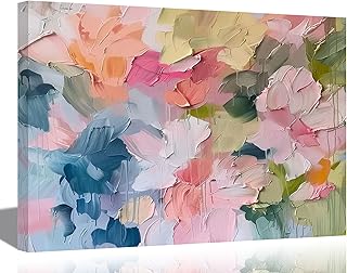
Sage Green Wall Art Set of 3
Excellent for cool and calming color schemes. The abstract green marble design brings nature-inspired tranquility to modern interiors.

The Color Scheme Bible: Inspirational Palettes for Designing Home Interiors
The ultimate reference guide for color palette ideas for home decor. This comprehensive book provides hundreds of professionally curated color combinations with practical application advice.
Professional Implementation Tips
Successfully implementing color palette ideas for home decor requires more than just choosing beautiful colors – it demands strategic planning, proper preparation, and attention to detail. These professional tips will help you achieve polished, cohesive results that look intentional and well-executed.
Color Testing Protocol
- • Paint large swatches (at least 2x2 feet) on different walls
- • Observe colors at morning, noon, and evening
- • Test under both natural and artificial lighting
- • Live with samples for at least one full week
- • Consider seasonal lighting changes
Layering Strategy
- • Start with largest surfaces (walls, flooring)
- • Add medium elements (furniture, curtains)
- • Finish with accessories and accents
- • Maintain consistent undertones throughout
- • Balance warm and cool elements carefully
Room function should guide color intensity decisions. Bedrooms and meditation spaces benefit from calmer, more subdued palettes, while social areas like living rooms and dining rooms can handle bolder combinations. Consider how the space will be used throughout the day and choose colors that support those activities.
Flow between adjacent rooms requires careful consideration. While each space can have its own personality, maintaining some connection through shared undertones or accent colors creates cohesion. This is particularly important in open floor plans where multiple "rooms" are visually connected. The principles apply whether you're working on cozy cottagecore interior ideas or contemporary urban spaces.
Budget allocation should prioritize permanent elements first. Invest in quality paint for walls and key furniture pieces in your chosen palette, then build layers gradually with less expensive accessories. This approach allows you to refine your color story over time while maintaining a strong foundation from the start.
Seasonal Color Considerations
Understanding how natural light changes throughout the year is crucial for selecting color palette ideas for home decor that remain beautiful and functional in all seasons. Light quality varies dramatically between summer's bright, warm rays and winter's cooler, more diffused illumination, affecting how colors appear in your space.
Spring & Summer Considerations
During warmer months, natural light is abundant and has warmer undertones. Colors may appear more saturated and vibrant. Cool color palettes can help balance the increased warmth and energy of longer days, while warm colors might feel overwhelming in spaces with significant sun exposure.
Fall & Winter Adaptations
Cooler months bring reduced daylight and cooler color temperatures. Warm color palettes become more appealing and necessary for creating cozy, inviting atmospheres. Colors may appear more muted, requiring slightly more saturated selections to maintain visual impact.
Successful year-round palettes often incorporate transitional elements that can be adjusted seasonally. Neutral foundations remain constant while textiles, accessories, and artwork can shift to accommodate changing light and mood preferences. This approach provides stability while allowing for seasonal refresh and personal expression.
Consider your geographic location's specific light characteristics. Northern regions experience more dramatic seasonal light changes than southern areas, requiring more thoughtful seasonal planning. Rooms with eastern or western exposure face particular challenges with dramatic morning or evening light that may require specific color adjustments. These considerations are especially important when planning vintage aesthetic bedroom setup projects where lighting ambiance plays a crucial role.
Common Mistakes to Avoid
Even well-intentioned homeowners often make predictable mistakes when implementing color palette ideas for home decor. Learning from these common pitfalls can save significant time, money, and frustration while ensuring your color transformation achieves the desired results.
Critical Mistakes
- Ignoring undertones: Mixing warm and cool undertones within the same color family creates discord
- Inadequate testing: Choosing colors based on small paint chips or online images
- Overlooking lighting: Failing to consider how artificial lighting affects color appearance
- All-or-nothing approach: Painting entire rooms without testing or gradual implementation
Design Missteps
- Trend-chasing: Choosing colors based on current trends rather than personal preference
- Proportion errors: Using bold colors in wrong proportions or locations
- Texture neglect: Relying solely on color without considering texture variety
- Flow disruption: Creating jarring transitions between connected spaces
One particularly common mistake involves rushing the decision-making process. Color selections should be lived with and observed over multiple days and lighting conditions. What appears perfect in the morning might feel completely wrong in evening artificial light. This is especially crucial for rooms used throughout different times of day.
Another frequent error involves neglecting the existing elements that cannot be easily changed – flooring, countertops, built-in cabinetry, and architectural features. Successful color palettes work harmoniously with these permanent elements rather than fighting against them. This integration is particularly important in projects involving wall art for aesthetic home where artwork must complement both the color scheme and existing architectural elements.
Budget miscalculation often leads to incomplete implementations that never achieve their full potential. Plan for the entire scope of your color transformation, including all necessary accessories, lighting adjustments, and finishing touches. A partially implemented palette often looks worse than the original space, making thorough planning essential for success.
Real User Experiences
Learning from others' experiences with color palette ideas for home decor provides valuable insights into both successes and challenges. These authentic user reviews from Amazon, Reddit, and Quora reveal practical considerations and real-world results from homeowners who have implemented various color schemes.
Jennifer M. - Amazon Review
"I purchased the Barydat boho wall art set to implement a neutral earth-tone palette in my living room. The quality exceeded my expectations, and the wooden pieces perfectly complemented my existing furniture. The installation was straightforward, and the set immediately elevated the entire space. My guests consistently comment on how cohesive and sophisticated the room looks now. The neutral tones work beautifully with seasonal decor changes, making this a worthwhile investment for long-term design flexibility."
Rachel S. - Reddit HomeDecorating
Verified Purchase"After struggling with color selection for months, I finally chose a cool blue-green palette based on advice from this community. The transformation has been incredible – my bedroom feels like a spa retreat now. The key was testing the colors in different lighting throughout the day before committing. I made the mistake of rushing with my first color choice and had to repaint. Taking time for proper testing saved me from another costly do-over. The sage green wall art recommended here was the perfect finishing touch."
David K. - Quora Interior Design
Home Renovation Experience"Implementing a whole-house color palette was more challenging than I anticipated. While the individual colors looked great in isolation, creating flow between rooms required multiple adjustments. The biggest lesson was understanding undertones – my 'neutral' beige had pink undertones that clashed with the gray-based whites I chose. The Color Scheme Bible book was invaluable for understanding these subtleties. Now, two years later, I'm completely satisfied with the cohesive result. The initial extra time and effort for proper planning paid off significantly."
Key Takeaways from User Experiences
- Proper testing prevents costly mistakes
- Quality products justify higher initial investment
- Understanding undertones is crucial for success
- Professional guidance saves time and frustration
- Patience during implementation yields better results
- Whole-house coordination requires careful planning
Ready to Transform Your Space?
Start implementing these color palette ideas for home decor today and create the harmonious, beautiful space you've always wanted.
Frequently Asked Questions
How do I choose the right color palette for my home's architectural style?
Consider your home's architectural period and inherent characteristics when selecting color palette ideas for home decor. Traditional homes like Victorians work beautifully with rich, complex palettes including deep jewel tones and warm earth colors. Mid-century modern homes complement clean, sophisticated palettes with bold accent colors. Contemporary homes offer the most flexibility, accommodating everything from stark monochromatic schemes to vibrant, eclectic combinations. The key is respecting your home's bones while expressing your personal style within appropriate parameters.
What's the difference between warm and cool color palettes, and which should I choose?
Warm colors (reds, oranges, yellows) create cozy, energetic environments that feel intimate and welcoming. They work well in social spaces, north-facing rooms, and areas where you want to encourage activity and conversation. Cool colors (blues, greens, purples) promote relaxation, focus, and tranquility, making them ideal for bedrooms, bathrooms, and meditation spaces. Your choice should consider room function, natural light exposure, and desired mood. Many successful palettes blend both warm and cool elements for balance and visual interest.
How many colors should I include in my home's color palette?
Professional designers typically recommend 4-6 colors for a complete home palette: one dominant neutral color (60% of the space), 1-2 secondary colors (30% combined), and 1-2 accent colors (10% combined). This formula, known as the 60-30-10 rule, ensures visual balance while providing enough variety for interest. Additional colors can be introduced through artwork, plants, and seasonal accessories without disrupting the core palette. Remember that different shades and tints of the same color count as variations rather than separate colors in your scheme.
Can I use different color palettes in different rooms?
Yes, but maintain some connecting elements to ensure flow throughout your home. Each room can have its own personality while sharing undertones, accent colors, or neutral base colors with adjacent spaces. This approach works particularly well in homes with distinct room functions or when transitioning between formal and casual areas. Open floor plans require more careful coordination, while homes with traditional room separation allow for greater color independence. The key is ensuring transitions feel intentional rather than jarring or disconnected.
How do I test paint colors before committing to a full room?
Purchase sample sizes and paint large swatches (at least 2x2 feet) directly on your walls in different areas of the room. Observe these samples throughout various times of day and under different lighting conditions for at least a full week. Test colors on multiple walls to see how they interact with natural light from windows and artificial lighting fixtures. Consider seasonal light changes if you're planning the project during transitional months. This thorough testing prevents costly mistakes and ensures your final color choice works perfectly in your specific space and lighting conditions.
What role do undertones play in color palette selection?
Undertones are the subtle color hints within what appears to be a neutral or straightforward color. For example, a beige might have pink, yellow, or gray undertones that become apparent in different lighting conditions. Successful color palettes maintain consistent undertones throughout – mixing warm and cool undertones creates visual discord even when colors seem compatible individually. To identify undertones, compare your color samples to pure white and observe which colors become more prominent. Professional color consultations often focus heavily on undertone coordination because it's crucial for achieving sophisticated, harmonious results.
Explore More Design Inspiration
Interior Styles
Room-Specific Guides
Conclusion
Creating successful color palette ideas for home decor requires patience, planning, and a willingness to experiment within established principles. The twelve designer-approved schemes presented in this guide offer proven starting points for any style preference or space requirement, from warm earth tones that create cozy sanctuaries to bold dramatic combinations that make striking statements.
Remember that the most successful color transformations begin with understanding your space's unique characteristics – its natural light, architectural features, and intended function. Testing colors thoroughly under various conditions prevents costly mistakes, while maintaining consistency in undertones ensures sophisticated, harmonious results that stand the test of time.
The recommended products and implementation strategies outlined here provide practical pathways to achieving professional-quality results. Whether you choose the minimalist home decor ideas approach with subtle neutral palettes or embrace the energy of bold jewel tones, success lies in thoughtful selection and methodical execution.
As you embark on your color palette journey, remember that your home should reflect your personality and support your lifestyle. While trends come and go, well-chosen colors that resonate with your personal aesthetic and functional needs will continue to bring joy and satisfaction for years to come.
Take inspiration from these ideas, adapt them to your unique space and preferences, and don't be afraid to make bold choices when they feel right for your home. The perfect color palette is not just about following rules – it's about creating a space that feels authentically yours while maintaining the harmony and sophistication that makes a house feel like home.